
QUESTION 1
In what ways do your media products use, develop or challenge forms and conventions of real media products?


The opening sequence of my short film immediately gives a sense of surrealism to the audience through the fast-paced editing. My intention was to use the repetitive glitch from the shot of the phone to a static, black, then bird’s eye view shot as a way of portraying the theme of excessive use of technology (conveying the ideology that millennials are far too reliant on technology), as it resembles a TV flicking through different TV channels. Additionally, fast-paced editing is a key convention used in Surrealist films, and I felt that the opening sequence uses this convention well, as I have applied it to my own ideologies of social media and the online age. I felt as though my intentions were successful, as one audience member said the opening shot of my film links to the “theme of social media and the online age”, therefore telling me my intentions were successful.
Furthermore, the ‘bird’s eye view’ shot of the girl implies a sense of sub-conscious to the audience. My intention here was to suggest that the girl can see herself and her own suffering of anxiety, but can’t do anything to stop it. This idea uses the convention of ‘emphasis on the sub-conscious’, but I feel as though this wasn’t evident to my audience members, as no one commented on it throughout the editing process. I also intended to position the audience in a God-like viewpoint, to create a connection between the audience and the character. My inspiration for this specific shot came from the montage video, created with shots from a wide range of films, on YouTube, ‘God’s Eye View’. The creator of this montage explains that this camera angle puts the audience in an omniscient position, which removes any POV reference. I feel as though this intention may have been successful, as one specific audience comment reads that it “got [their] heart beating fast, especially at the beginning”. This audience comment tells me that they were beginning to connect with the character and started to form a sense of sympathy for her, as it caused physical signs of emotion.
This sequence also gives a sense of Surrealism straight away to the audience through the sound. The static shot with the white noise sound foreshadows the rest of the film, specifically the climax, as it suggests damage or a fault of some sort. Furthermore, the non-diegetic lightning sound – which symbolises the power of the phone and the significant effect of attachment it has on the girl – was a result of an intention of mine by which I wanted the audience to be confused. This additionally foreshadows the rest of the piece to come, as it’s very digital, therefore fitting my themes (which were: over-use of technology, and anxiety). Additionally, the baby laughs and sudden cuts can be associated with the conventions of Surrealist films due to the chaos it creates, furthermore making the audience question what is to come.
Moreover, the opening sequence portrays surrealist aspects through colour. The saturation of the shots implies a sense of fulfilment for the character, and that her life is colourful and interesting when her phone is nearby. This was intentional, as I wanted the audience to understand the significant change in the girl’s identity and personality after the phone breaks, due to the complete contrast in the colour of shots from saturated to monochrome later in the short film. This develops the convention of ‘fragmentary characters’, as the symbolisms of loss of identity and anxiety are evident, and this is supported by an audience feedback comment that reads “it is clearly linked to feeling excessive anxiety”.
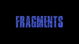
I chose to call my short film ‘Fragments’. This is because it foreshadows the damage to the phone, and the damage to the character’s emotions. I chose to include a fragmented font from ‘DaFont’, specifically in a blue colour, to symbolise the theme of social media, as a common colour scheme is blue, such as the Facebook and Twitter colour schemes. The cracks in the font are there to represent Hannah’s (the main character) sense of self, her anxiety, and therefore fragility. Additionally, I chose a royal blue colour as it is recognisable as the colour scheme for Facebook. This is significant as my short film is about a girl with anxiety who views her phone as her personality, therefore she uses her phone, especially social media, a lot because she identifies with it. Furthermore, other social media sites, such as Twitter, use blue as their main colour scheme. The blue also represents the ‘blue light’ of phone screens, therefore linking massively to technology and excessive phone use. These ideas could, therefore, be injected into audiences through the constant repetition of blue colours, and possibly enable them to question whether they use technology too much. I chose this title, colour and font because I wanted to suggest to my viewers what the hegemonic ideologies in the piece are – my ideologies in my short film are: that millennials are far too reliant on technology, as suggested by responses in my social realism questionnaire, and that anxiety is really difficult to live with and treat, and people need to be made more aware of this. I feel as though this was successful, as one specific audience comment said: “I think this is really good! It really gets the message across. I like the way that it follows the title, as in it keeps fragmenting etc.”. I feel as though the bright colour amongst the dark background and the cracks within the font stress conventions of a Surrealist film, as a key convention is fragmentary characters, which is furthermore portrayed in the title’s effects.
In addition to this, I chose to start my short film (after the credits) with a close-up of the phone. It is positioned centre-frame, taking up a large amount of the screen. This gives the audience a bit of context for the rest of the piece, and tells them what the main theme is (excessive use of technology and social media). The phone is placed on a pillow, personifying the phone as a human who needs to be nurtured and comfortable, again giving the audience more context. There are no humans in this shot because it is suggesting that all we need to communicate with each other is our technology, and that visual communication between two people isn’t required. This, therefore, implies my theme of technology. Additionally, as mentioned above, the fast-paced editing of the opening sequence builds up the tension and represents the theme of technology and that we are globalising and causing the world to ‘shrink’ by using technology. This additionally represents to convention of abrupt shot cuts that are typically used in Surrealist films.
The pattern of the bedding that the phone is placed on is significant in terms of the plot. The vibrant colours in the bedding work well with the saturated shots during the first half of the short, and really signifies the contrast between the saturated and monochrome shots. The colours also represent the fact that the main character’s personality is whole and colourful due to the presence of the phone, therefore foreshadowing the abrupt change in personality later on in the short, which emphasises that the main character’s personality is no longer interesting or existent.
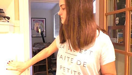
In terms of costume and framing choice in the kitchen scene, my main character’s pyjama top was important, because it acts as a hidden message. The writing on the top translates from French to “Life is made of lots of little moments of happiness/joy”. This acts as a hidden message because the happiness or joy that is referred to on the top is associated with the phone. Furthermore, the baby noises throughout my piece continue to imply this, suggesting that the phone is her child, therefore her happiness. However, I don’t feel as though my intention of this was successful, as none of my audience feedback comments mention anything about it, but it’s quite difficult to read the top in it’s entirety. I could’ve prevented this by framing the shot differently. The saturation of this shot is also effective as it foreshadows the rest of the film to come, like mentioned earlier on. It significantly contrasts the monochrome coloured shots from the halfway point of the film, therefore foreshadowing the convention of fragmented characters.
The location of this shot is the main character’s house. This symbolises security and control, and familiarity. This foreshadows the middle of the short where the phone breaks, because once it is broken, she feels as though she is insecure and not in control due to her anxiety attacks. Additionally, it also foreshadows the scene where the main character is in the phone shop and becomes overwhelmed as she is so familiar with her phone that she can’t possibly try something different.
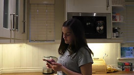
Again, the saturation of the shots during the first half of the short emphasises the main character’s colourful personality due to the presence of the phone. Furthermore, the fact that she turns the light on when she walks into the kitchen symbolises that she is in control of her anxiety and her life is complete at this present moment. The light also represents the omniscience as mentioned earlier, which was my intention. I don’t feel as though this was successful due to the lack of audience comments about this intention.
Furthermore, my short film is located both at the character’s home and in town. This was deliberate, in that the girl seems to be secure and happy in most of the shots inside, but once the phone breaks, she is exposed and vulnerable to the outside world. This reinforces the idea that her phone is her identity, suggesting to the audience that, because her phone is broken and has nothing to identify with, she is completely exposed and lost. This portrays a surrealistic idea to the audience, stressing that the character is fragmentary/not fully rounded, therefore fitting the key conventions of my chosen genre.
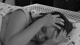
Additionally, I chose to change the colour of the shots after the scene where the phone breaks. I did this to portray a change of emotion and identity; because her phone is broken, her world is broken, too. I know that this was successful, due to one of my audience feedback comments: “The change of colour is prominent and reflects the change of emotion by the girl, it would appear she has anxiety from the video she was watching earlier.” Furthermore, this shot works with my genre, as it fits with the convention of a disturbing and chaotic atmosphere. This shot and many others are also complimented with static effects and white noise sound to stress the chaos and disturbance. The monochrome colour of shots in my short film was inspired by Ben Wheatley’s ‘A Field in England’. I was fascinated at how Wheatley subverted the conventions of the genre of Surrealism whereby the film was edited to be entirely monochrome, implying themes of history, which I find was successful.
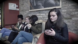
Moreover, I deliberately positioned Hannah's character in the foreground of the seventh frame with the other girls in the background, as it presents Hannah’s character and additionally shows an aspect of the story. Hannah is deliberately in the foreground, mainly because she is the main character, so she is the main focus. However, I also did this because the audience is able to clearly see her reactions to the other people laughing at her, therefore creating a larger level of sympathy within the audience for Hannah. I made sure to include the phone (which is now bandaged) in the shot, to stress that she doesn’t want to let go of it, and that she misses it, clearly suggesting that she is lost without her phone. This shot signifies that Hannah feels self-conscious and anxious without her phone, furthermore implying to the audience the ideologies of excessive use of technology, which a passive audience will think about in their own lives. Additionally, the colour that overlays this shot stresses to the audience that it is all in Hannah’s imagination, thus implying a sense of fragility, vulnerability, self-consciousness, anxiety and surrealism due to the conventions (such as subconscious dreams/desires). I feel as though this was successful, due to the transition/zoom effect I used between the ‘reality’ and ‘fantasy/imagination’ shots.
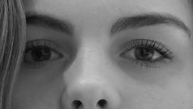
The extreme close-up of Hannah's eyes deliberately subverts the convention of the audience not being able to connect with the character, however, it deliberately uses the convention that nothing is out of bounds and creates a disturbing/chaotic feeling within audience members. I used a non-diegetic sound recording of a heartbeat and heavy female breathing to stress the chaos and emotion evident within Hannah. The frantic movement of her eyes fits well with the heartbeat and breathing, and I intended for this to create suspense within my target audience.
However, I chose to subvert and challenge some conventions of Surrealis films. I did this by creating a film targeted towards a similar age group to my main character, which challenges the ctonvention where the audience is unable to connect with the characters. I did this because the themes and ideologies seen throughout my short film are focused on technology use and social media which mainly influences teenagers and young adults. I wanted to subvert this convention because I felt that if I had created a short film where the audience is unable to connect with the character, it wouldn’t have given people such a strong message that could’ve potentially changed some audience members’ ways of living.
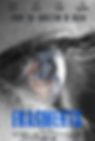
I chose to call my short film ‘Fragments’. This is because it foreshadows the damage to the phone, and the damage to the character’s emotions. I chose to include a fragmented font from ‘DaFont’, specifically in a blue colour, to symbolise the theme of social media, as a common colour scheme is blue, such as the Facebook and Twitter colour schemes. The cracks in the font are there to represent Hannah’s (the main character) sense of self, her anxiety, and therefore fragility. Additionally, I chose a royal blue colour as it is recognisable as the colour scheme for Facebook. This is significant as my short film is about a girl with anxiety who views her phone as her personality, therefore she uses her phone, especially social media, a lot because she identifies with it. Furthermore, other social media sites, such as Twitter, use blue as their main colour scheme. The blue also represents the ‘blue light’ of phone screens, therefore linking massively to technology and excessive phone use. These ideas could, therefore, be injected into audiences through the constant repetition of blue colours, and possibly enable them to question whether they use technology too much. I chose this title, colour and font because I wanted to suggest to my viewers what the hegemonic ideologies in the piece are – my ideologies in my short film are: that millennials are far too reliant on technology, as suggested by responses in my social realism questionnaire, and that anxiety is difficult to live with and treat, and people need to be made more aware of this. I feel as though this was successful, as one specific audience comment said: “The fonts are fab …! The colour of the title links well with the image in the eye. The cracked effect on the title and the names at the top are very effective and link to the eye and the film well.” I feel as though the bright colour amongst the monochrome image and the cracks within the font stress conventions of a Surrealist film, as a key convention is fragmentary characters, which is furthermore portrayed in the title’s effects.
I chose to lay the poster out this way to look conventional to typical film posters, such as the layout of the French Surrealist film ‘Un Chien Andalou’. The credits and tagline are conventionally at the top and the title is at the bottom, with the focal image in the centre of the poster. The positioning of the eye is significant, as it stresses the loss of identity and the vulnerability of the main character, but ever so subtly. The colour in the eye suggests a sense of hope and happiness, and this foreshadows the storyline of my short film, as the main character loses her identity when her phone breaks. The monochrome colours further stress this idea, as it links to when the colour of shots in my short film abruptly change from saturated to monochrome.
Furthermore, I feel as though the cracks and the extreme close-up of the eye portray the story quite well. The cracks in the eye foreshadow the damage to both the girl’s personality and the phone, which works well with the image of the phone as the reflection. This allows the audience to encode the story from the poster.
Moreover, I feel that my poster suggests my chosen genre of Surrealism, due to the extreme close-up of the eye. One convention of Surrealist films is that ‘nothing is out of bounds’, and that Surrealist films are meant to be strange and make the audience feel slight discomfort. I feel like the extreme close-up of the eye suggests this because it’s such a large image and may intimidate potential audience members. An example of a real text that uses similar elements is the ‘Girl with a Shell’ movie poster. This is because there is an eye seen in the tunnel of the shell, which confuses the audience and makes them feel as though they’re being watched, therefore breaking boundaries.


In my magazine spread, it is evident that my main character is fragmented. This is because she is in the foreground by herself, wearing long-sleeved clothing with a bandaged phone in her hand. This represents the conventions of ‘fragmentary characters’ which is often seen in Surrealist films.
Additionally, the colours of the entire spread are all different and this seems quite strange. The colours link to the theme of anxiety that is present in my short film, as the colours are ‘all over the place’, which symbolises the girl’s anxiety and personality, as she is out of control when the phone breaks.
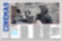
I think the image sets the story up nicely, because it clearly shows one girl who is separate from three others who are all looking awkwardly at her or away from her to suggest that she is strange. Additionally, this is supported by the phone in the foreground of the image. The girl that the others are staring at is holding a bandaged up phone which explains why they are staring at her, therefore giving the audience an idea of the story, therefore determining whether they would like to see it or not.